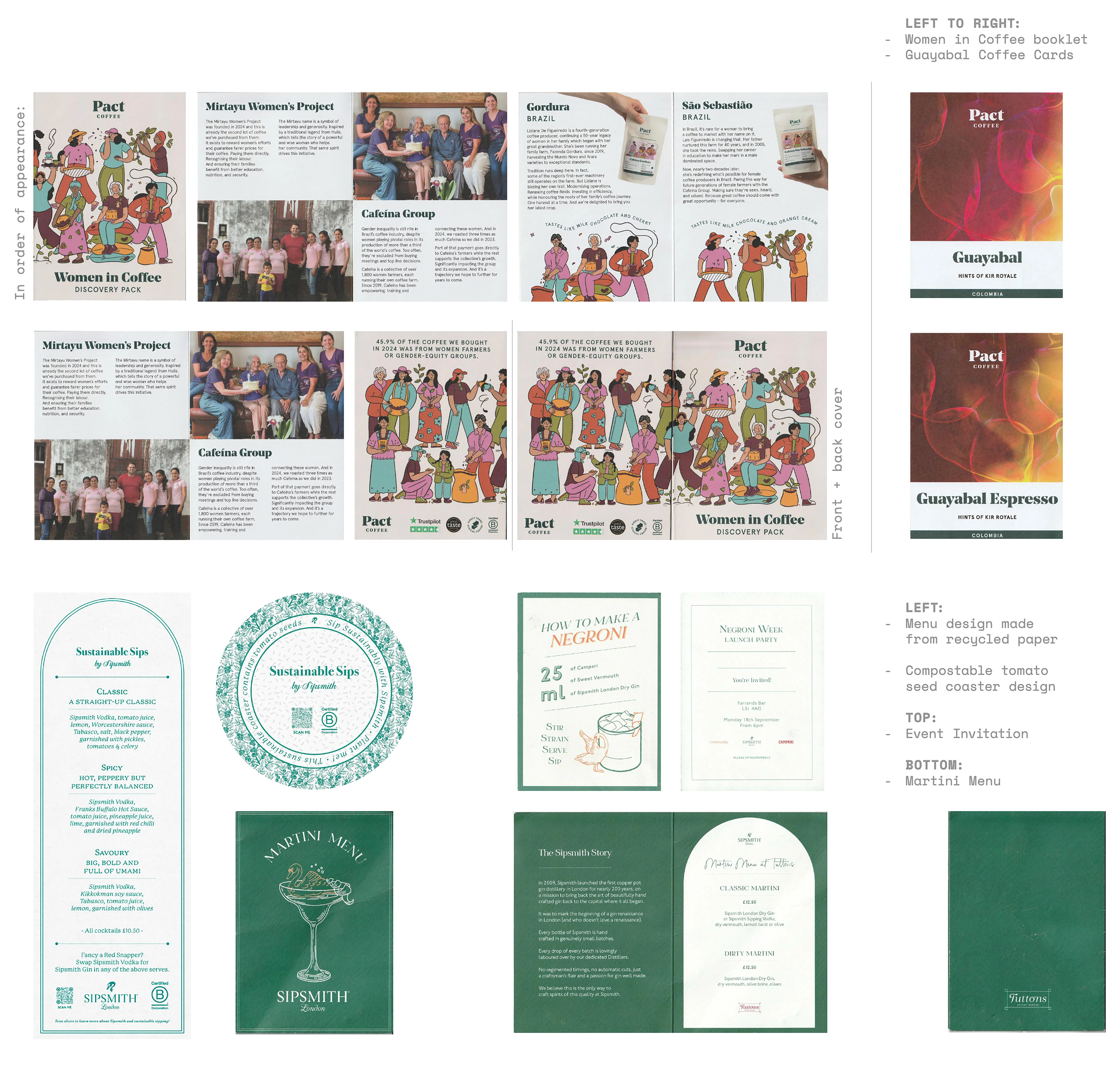
Print collateral (above) (2023/2025)
- coaster, menus & invite for Sipsmith
- booklet and cards for Pact Coffee
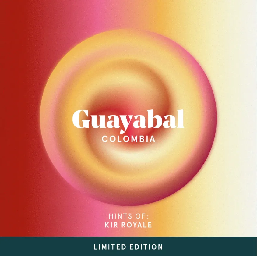
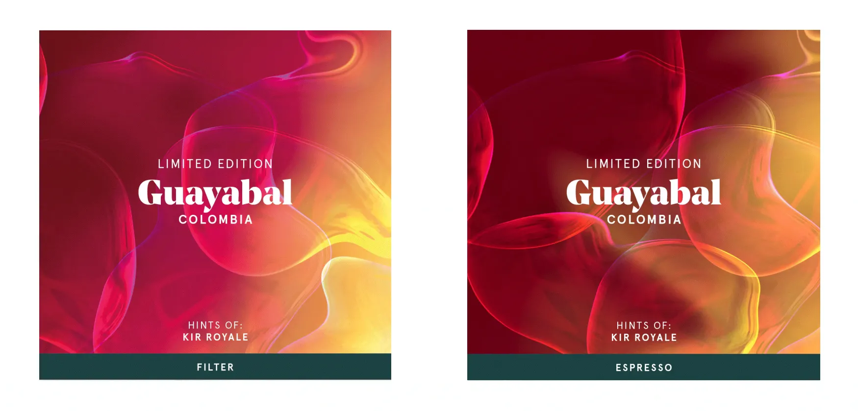
Limited edition coffee (2024)
- label design
- concept development
- finished product
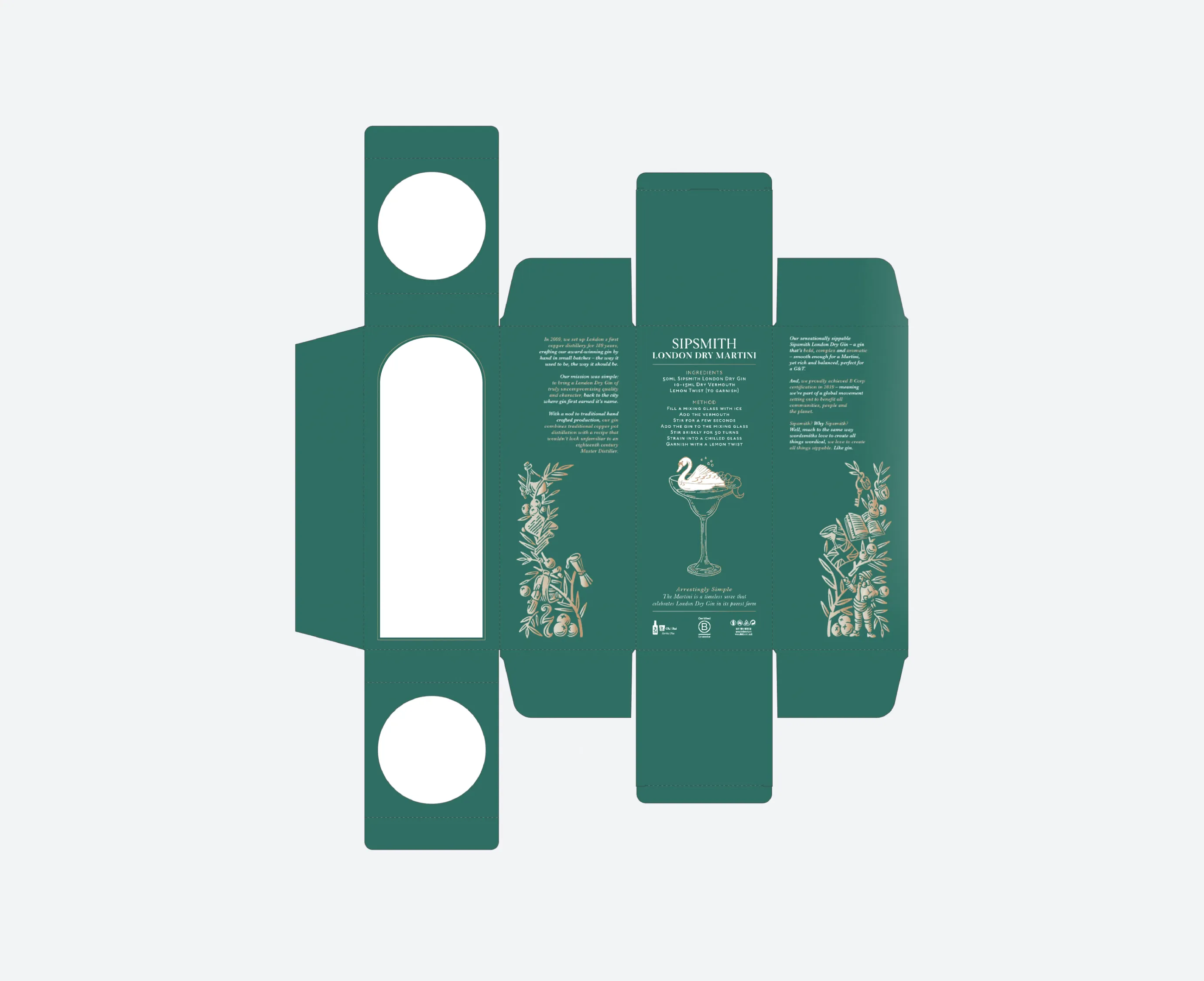
Packaging design (2024)
- first concept
- finished project