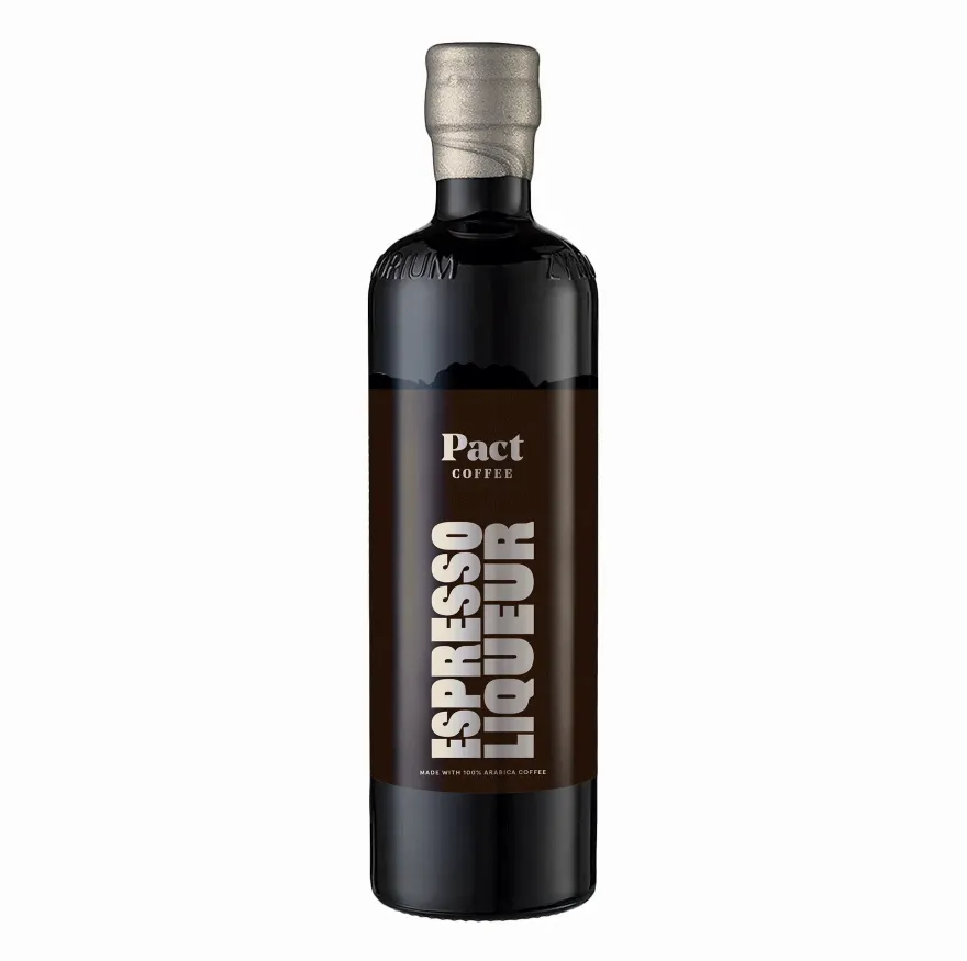
Espresso Martini Kit
- new product development
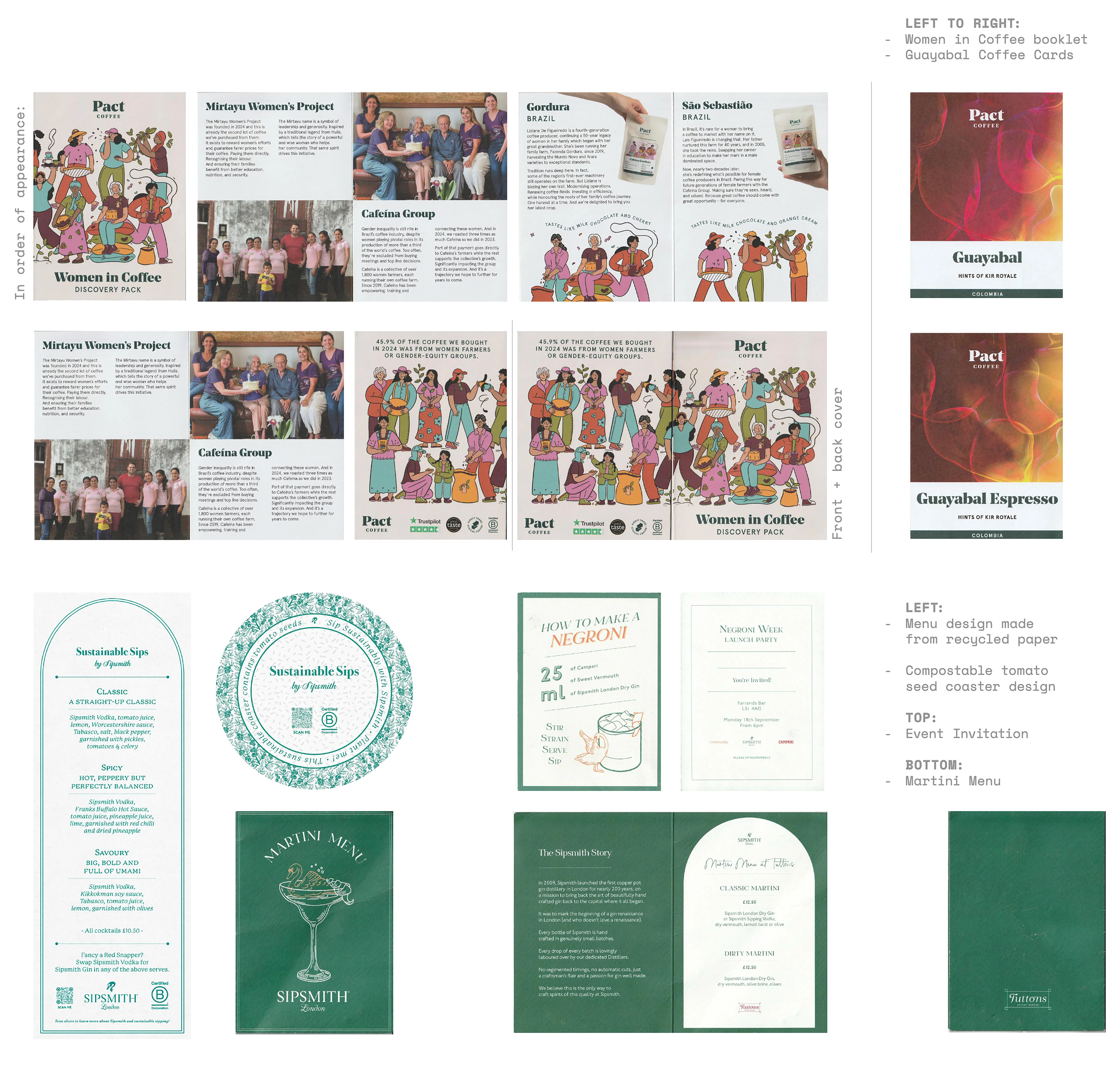
Powered by Pact
- logo design
- merch design
- artist collab
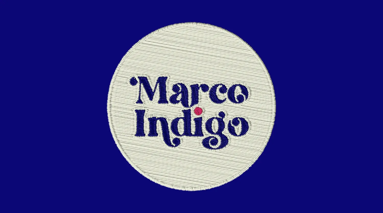
Marco Indigo
- logo design
- brandboard
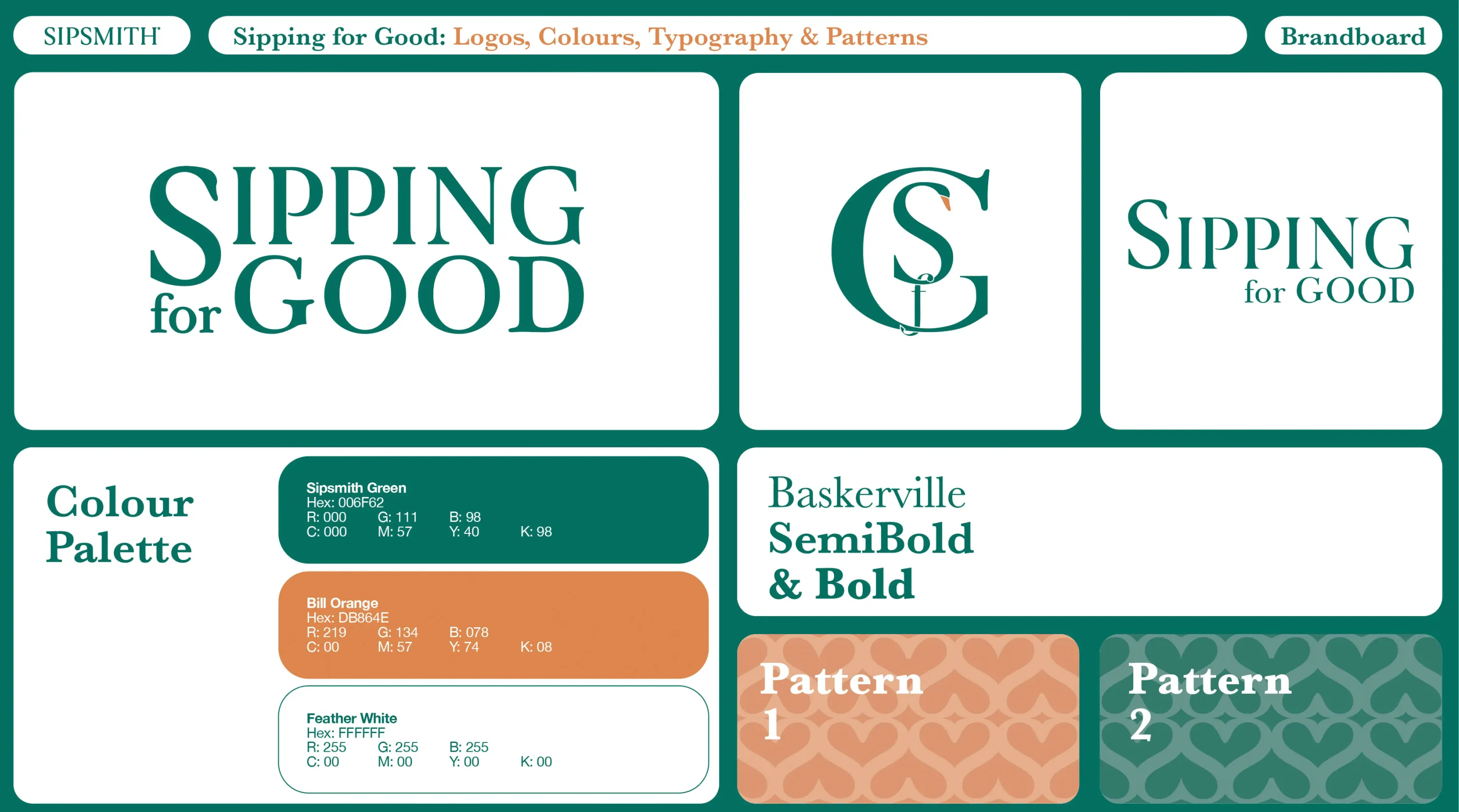
Sipping for Good
- logo design
- brandboard
Espresso Martini Kit
- new product development
Powered by Pact
- logo design
- merch design
- artist collab
Marco Indigo
- logo design
- brandboard
Sipping for Good
- logo design
- brandboard