branding & VIs ID

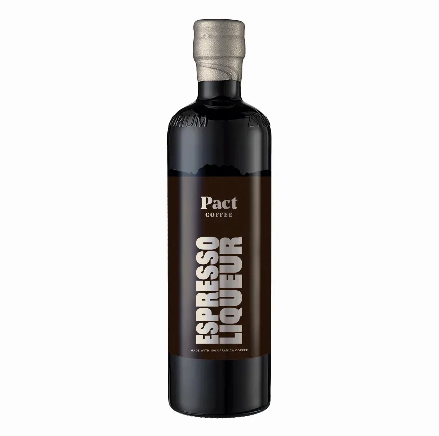
Espresso Martini Kit
(2024) 
- new product development process

Powered by Pact
(2025)
- logo design
- merch design
- artist collab


Marco Indigo
(2023)
- logo design
- brandboard

Sipping for Good
(2023)
- logo design
- brandboard

New Product Visual Identity:
The evolution of the Pact Coffee Espresso Liqueur label and packaging


FOCUS

• New product offering

AIM
• Make it distinctive from competitors but somewhat familiar to consumers 

CHALLENGE
• The label cutter provided a limitation due to the constraints of it’s unique shape

IDEATION
• Pulling inspiration from the past and turning it into something contemporary

INSPIRATION
• Vintage packaging designs, Bold Minimalism, Art Deco themes: light bursts, rectilinear shapes and geometric shapes
Campaign branding & VIS ID - in collaboration with illustrator Hattie Clark
Click here to view social post

PURPOSE
• Powered by Pact is a sports-led campaign that needed a face and visual identity

COLLABORATION
• In collaboration with illustrator Hattie Clark, we crafted a design that would be used digitally on socials, as well as part of an exclusive merchandise collection

PROCESS
• The logo was completed prior to the final illustrations being seen, and when they where signed off, the characters were sent individually (as seen above)
• Customised lettering with subtle lightning bolt motifs link to the campaign name and limited edition coffee 'La Energía'

SUMMARY
• The characters were positioned in various iterations of the lock up for different uses
• Having them interacting with the logotype in different ways felt right, as if they were made for each other
• Just like Hattie's illustrations, the logotype is bold, fun and pairs suitably with her artwork
THE BRIEF
• "Our brand is all about subverting the expectations of a typical ice cream shop"
• "We keep the fun, inviting, and playful spirit—but with a more grown‑up edge"
• "We want to create a sense of mystery, so people walk in expecting to be surprised by something new and exciting"
• "Our audience is young adults, especially social media influencers"
• "We’re redefining the idea that ice cream is just for kids—we’re adults, and we’re genuinely passionate about it"

MEANING
• 
Often symbolising connection and community, the design relies on the use of circles, contrasted with clean, straight lines for a refined touch
• The combination of shapes echo the motion of ice‑cream scoops, striking a balance between playfulness and style
• This visual identity nods to classic ice‑cream brands, while keeping a modern, individual feel and a subtle hint at the product

COLOUR
• The colour palette draws directly from flavours and the brand name:
- Lemon Vanilla for softness and a creamy citrus tone
- Marco’s Indigo being the core brand colour
- Sweet Tooth Pink as an energetic accent, shifting lighter or darker depending on contrast

SUMMARY
• Designed for a screen‑first audience; the design maintains a sense of individuality and maturity, the colours create a vibrant and stylish vibe
• The branding is aimed at younger social‑media‑savvy audiences, fusing nostalgia and minimalism, with a touch of mystery and intrigue
THE BRIEF
“We need a logo for our charitable organisation: Sipping for Good.”

SHAPES AND SYMBOLISM
• Using Sipsmith's iconic Swan brand mark, mirroring and repetition this resembled a heart-shaped background pattern
• The heart shape is also used to house the 'SfG' monogram

TYPOGRAPHY
• The primary and secondary logos are a combination of the brand's existing wordmark typeface (Joane -  a sharp serif) subtly combined with a softer serif (Baskerville)
• 'Sipping' (shown in Joane) links directly to the brand's elegant visual language, where as 'for Good' (shown in Baskerville) creates a more positive emotional connection

Next projects

PRINT & packaging